Wednesday

Evaluation

 All final designs.


Overall I am extremely happy with my outcomes to this brief. I chose this brief for a challenge to push my imagination, and I think I have certainly done that. I am most happy, not with the style of the designs necessarily,but with the concept and how they tie in with the whole meaning of the novella. The transition between the 2nd and 3rd dimension being the key point. I also believe I have successfully taken an old novella from the 1800's and brought it into the modern day to represent a wonderfully complex book, but in a totally new and unique way. Looking back at this project there really isn't much I would change if I could do it all over again.

Designs in situ.


I decided to super-impose my designs into the gallery surroundings they were made for. I think they look really good together, and the illusion idea comes together really well while people are still able to meander in and out of each design.  Time and costs allowing I would love to print out a whole chapter at full size and set it out for real. Maybe some day i'll be able to do just that.

Monday

Other chapter examples


Here are examples of how chapters 2 and 3 would look. The layout and concept has been kept the same, but a different graphics has been used in each. I have also gone for a different illusion typeface, trying to pick ones that related to the shapes in their supporting graphics. I especially like chapter two because of the colours and way the triangular typeface works with the design. Maybe even more than chapter one, but all in all I think these designs would like up and gallery.

Think I have it!

 I am finally happy with my design. I think it has good structure with the grid system, and the type is set very minimally and in an easy to read way.  The graphics and large 'illusion' type is dominant in size but not in and overpowering way. The opacity and use of subtle colours means it is a support to the type and not over powering. I also settled on having the chapter number in the top corner, being white it blends into the imagery, but is still clearly visible. I am really happy with this outcome and the journey I took to get here. Now to show examples of how the other chapters would look.

So close!


I feel like I am so close to an end result. Came to the conclusion that the type should be at the foot of the design and not head. This was partly for style reasons, but mostly for the fact that it would be a lot more practical in a gallery environment. Although I intend these designs to be A2 or even A1 size and because of that can get away with the small type, it may still be hard for people to read if at the top. Instead it should now sit roughly at eye line. 

I experimented with reversing the type out of a darker background, but don't think the design flows as a whole like it does with a white background. The white border pulls all the elements together. I really like how all the main text sits together at the bottom though, and love the minimal style, but still think it could be slightly tidier. Maybe smaller paragraphs still, or not doubling up on the subheadings?? Will look into this.

Developing my designs


Here are a few examples of my developed designs. I have put my 5 column grid into action and think it has immediately given the designs more of a backbone. The two above are my favourite I think. I have really been influenced by the simplicity of the Swiss typo and also taken on board what I learned about the hierarchy of type. Mainly changing the sizes and styles of the type to bring prominence to important parts such at the title and chapter.

Below are the 2 other designs, I tried something different with these. Like in my initial designs earlier I have focused on the chapter information being the main focal point of the design. I have also works with the grid and tried spreading the type over a number of columns or having it all run down one column.

Out of all these designs I think the main elements I will take with me further are, the small paragraphs one column wide although I think these could be tighter and better set, the text having a white background as it is much easier to read, and also the importance of having the chapter number clear to see for practical reasons.  I feel like I am really close to a final outcome now, just need a few more tweaks.


Sunday

Experimenting with my own grids!


These are some sketches I did when looking into grids. For me the 5 column seems to work the best. You get the structure and strength that a grid should offer, along with enough room to experiment and to be creative. It is not perhaps the most common grid system the 5 column grid, but I intend to utilise it to the fullest and enable it to bring order and control to my designs.

Looking at grid systems.


I should have perhaps looked into grid systems earlier on in the process, but better late than never. As a young designer it is so easy to forget about the vitals, but aving a grid really is vital. Even more so if I want to mimic the swiss style. Grids come in all different styles and numbers, some allowing for more variation and others more structure. It is important to remember that they are guides not boundaries and you can still have order while spanning over a number of columns. I am going to experiment with a few until I find the right one for me and the style I aim aiming to achieve.

Swiss typography


Needing some inspiration as to how I should layout the main text on my posters I decided to turn to swiss design. I looked at JMB for inspiration on the use of shapes in design, but wanting a neat and tidy type setting I couldn't think of a better style to look at. It is evident that grid systems play a big part in swiss type, but what attracts me most is the small point size and short paragraphs. This makes it extremely easy to read, if printed at a realistic size, and also leaves a good amount of space for the imagery and graphics to work. I am going to look at grids and then experiment with this style of type.

How to set my type?


When it comes to the hierarchy of type these are the key factors to bare in mind. Size, colour, weight, style and combination. For my designs I think the main focus will we on size and combination. This is mainly for the purpose of the body type because the illusion is more part of the imagery. I want to keep it clean and concise without much change so I will have to work to these factors in order to produce the best outcome possible.

Early designs.


Here are some of the first ideas that I have put together digitally. I have tried to visualise whether it would be better to have to text at the head or foot of the design, and also whether it should be put straight over the background graphic or whether it needs its own white background to make it easier to read. The chapter number is something that I think could be important in a gallery setting to make it easier for people to navigate where they need to read next. Because of this I tried to make it stand out more than the rest, although I don't think it quite works as it is now. Also I am not liking how the large 'paragraph of text looks, and more so it doesn't yet follow any typographic rules. As i said, these are only first visuals, but I think I will look at grid systems and type hierarchy before I continue.

Chosen typefaces!

The decision has been made. I am to use Origami for the main 'illusion' type and Gill Sans for the body type. My reasoning behind Origami font, is that it is kind of segmented because it is made up of parallelograms, it also also one of the easier to read that I found. Another idea I've had, is that this typeface could change from chapter to chapter and represent whatever shape is in that chapters graphic. Confusing I know, but that is something that can be developed, for now this is my choice for chapter 1. And the reason I have chosen Gill Sans is because it has that slight edge to it that the likes of Helvetica doesn't. Also with the ideas I have in mind Helvetica would be the obvious and easy choice to take. Gill Sans will serve its purpose and do it well. I think I will keep Gill Sans throughout each chapter design for some continuity.

Typeface selections


 One of, if not the, most important element of these designs is the typeface selections. I am using two different typefaces in my designs, so started to look into finding the most suitable of 2 very different styles. 

I have settled on the fact that for the 'illusion' part of my design I want to use a type that is of the style I found in my research. These are bold, mostly quite contemporary, fonts that are either made up/from shapes or have elements of shapes. This is important for me as I am basing a lot of my styling around the topic of the book, the shapes and dimensions. This type still needs to be readable though and cannot be purely eye candy.

The second typeface I am looking into is for the main body text. I have decided this must be clear and simple, and very legible, so narrowed the options down to a choice of 3 sans serif typefaces. I am going to experiment with these that I have found and make a decision soon before I develop my designs any further.


Some initial layout ideas.


These are some early layout sketches that I did in order to visualize the poster design and to try find the look that I was aiming for. I think even at this early stage I was sold on the idea that the body text had to be small, precise and easy to read, leaving room for the rest of the poster to be more creative. I also found it interesting to see how the illusion type would come together. These early sketches show me playing with sizes before I had worked out how it would all actually come together. One thing that I did know was that I wanted each poster to be the same dimensions, so the illusion would be large on some and small on others.

Supporting graphics

The first piece of design work I have done on this project is for the supporting graphics in my designs. Although I am yet to work on any layouts or grids, I just knew that I wanted these designs to be subtle and to represent the 2d into 3d idea.

Using illustrator I turned normal 2d shades into their 3d counterpart. I then positioned them so that it was as if you could visually see the 'evolution' happening. I don't know how I am going to use these graphics yet, but I decided that for each different chapter of the book the colour scheme and shapes could change. In a gallery setting this would give each room a different vibe and would make it much more of a visual spectical.

I am really happy with how these look at this stage. I have avoided bold colours and used smooth gradients to create a 'washy' look. I have also applied textures and patterns as overlays to give the designs more depth, as well as for aesthetic reasons.


Friday

Another dimension in type??


As i touched on previously, 3d type is all the rage at the moment, with more demand for it from clients as well as more software being created to make it easier for designs to produce. There's definitely something about the 3rd dimension that fascinated us. Despite the fact that everything we see with our own two eyes, and touch with our hands is real and has shape, we are always searching for ways to make things look that bit more exciting and mind blowing, including films, games and very much design.

Despite the fact that 3d typography would be extremely relevant for this brief due to the nature of the book Flatland, I don't think it will work too well in the context of my designs. The 3rd dimension can be an illusion in itself, so I think I will find a way to shape 2d into 3d using my designs.

Shapes in type.


The use of shapes in typography is something that I found sitting right under my nose. With the current design trend being all about 3d, some really quirky but really effective fonts such as these are being some what over looked. 

Type built up of shapes or even cut out of shapes is predominantly a visual feast. As you can see just by looking through some of my examples here, not every letter or word is easy to read, so you certainly wouldn't have loads of body text set in uber blockville type. However, is used sparingly and for the right reasons, it could look very good incorporated into my designs, maybe as part of the illusion as opposed to the book text?? Certainly something that I will look into.


Contemporary shapes.

As well as going back to look at pioneers of type and design, I also wanted to look at how shapes are being used in design today. Everything in design can use shapes, most often for a purpose such as in logo design, but here are some examples of how shapes can look good.

There is an example of minimalist design with a contemporary twist, as well as a grungy burst of colour and shapes. I like the idea of shapes being used in patterns and seen as the type is to be the key focus in this brief, maybe that would be a good way to include shapes in my supporting graphics. There are endless possibilities when it comes to using shapes, but I just need to find the right way to do it in favour of my design idea.


Joseph Muller Brockmann

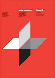
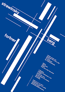
Joseph Muller Brockmann was a pioneer for Swiss style typography and design. The reason I chose to look at his work was because he really broke the mold with his experimental grid systems and also his use of colours and shapes. Here are a few examples of his work. He had a very minimal style, but I wouldn't call it simple, every single factor is meticulously worked out and done for a reason. The way he sets type is also really interesting, but I will look at that more later on.