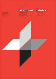
Needing some inspiration as to how I should layout the main text on my posters I decided to turn to swiss design. I looked at JMB for inspiration on the use of shapes in design, but wanting a neat and tidy type setting I couldn't think of a better style to look at. It is evident that grid systems play a big part in swiss type, but what attracts me most is the small point size and short paragraphs. This makes it extremely easy to read, if printed at a realistic size, and also leaves a good amount of space for the imagery and graphics to work. I am going to look at grids and then experiment with this style of type.


No comments:
Post a Comment