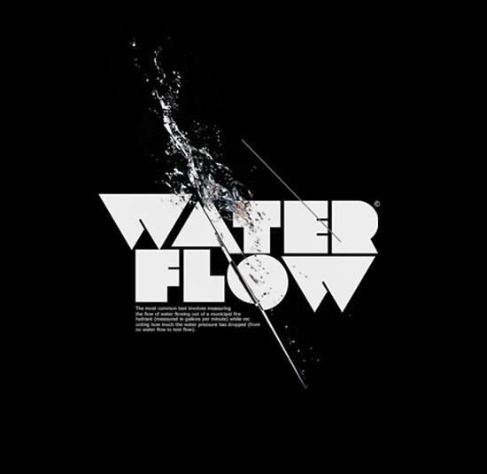


The use of shapes in typography is something that I found sitting right under my nose. With the current design trend being all about 3d, some really quirky but really effective fonts such as these are being some what over looked.
Type built up of shapes or even cut out of shapes is predominantly a visual feast. As you can see just by looking through some of my examples here, not every letter or word is easy to read, so you certainly wouldn't have loads of body text set in uber blockville type. However, is used sparingly and for the right reasons, it could look very good incorporated into my designs, maybe as part of the illusion as opposed to the book text?? Certainly something that I will look into.


No comments:
Post a Comment