Friday

It's all about shapes!


With this book being predominantly about shapes, and the hierarchy of Victorian culture directly corresponding with the number of sides that each character has, I though it only right to include shapes in my designs. I will be looking at 2d shapes and 3d ones, from one sided to 28 sided, and looking at how shapes can be used in design and also in typography.

My chosen way & Strategy.

So I think I have come to a conclusion on the route I am going to take for this project. Having had my eyes and mind opened by the anamorphic typography I came across in research, I really wanted to experiment with that idea and evolve it into poster design, somehow.


Although this is only a very rough sketch it was the image that I had in my head. Set in the context of a gallery, with the slightly more sophisticated and intellectual, but not necessarily old, as my target market audience, I want to transform the Flatland book into an exhibition oh hanging posters.

Each room could contain one whole chapter from the book. And when you walk around each room you read segments of that chapter on the hanging posters. You can walk all around them, emphasizing the nature of the 3rd dimension, and when up close each poster will simply look like type set upon a nice visual. But it is when you get to the end of the room (or at the start...) that your eye is at the right angle and perspective for all the posters to line up and display typographically 'FLATLAND' across your entire eye line. This being the illusion. Obviously this is all still an image in my head, but I am going to research into more elements and styles and try to make it a reality.

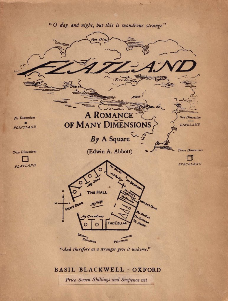
The reason I have chosen the context of a Gallery is based on the whole ethos of the novella. It was written in Victorian times and still reads that way throughout, but also without stereotyping or anything, it is a very complex book which is publicly admired by people in the maths, science and computing fields. And so I believe these are the people who are more likely to head to an exhibition and walk through having a read and sipping on some wine! But, as I said, not necessarily just the older generations. I plan on bringing the styling of the book/posters into the modern day and to create something that could visual appeal to all.


Typo poster styles.


I decided to look into typographic poster design. Out of all the ideas I had for 'a book that isn't a book' I think this is not only one of the most realistic outcomes, but also one of the most open and flexible. Posters are used for many things such as advertisement, art or simple expression. 
Here I have found 4 typo poster styles that caught my eye while researching. With Flatland being a story it is vital that the design be readable first and foremost, and although very different, I think each of these would serve that purpose well. Be it simple like the first image, busy and bold yet visually intriguing like the 2nd, chaotic but powerful like the 3rd or contemporary and exciting like the last.

The idea of a set of posters to display Flatland's story really interests me purely because it takes a book to a large scale, and if I can find a way to work my illusion idea into this I think I could produce some interesting designs.

Anamorphic Typography


While researching typographic styles and techniques I came across these quite unusual examples, called anamorphic typography. This is an idea based around illusion, with depth and perspective playing an integral part. 

Most commonly seen in corridors, doorways or open rooms, the type is plastered/painted down the walls and other surfaces at distorted angles. This makes the type pretty much unreadable, until that is, you are positioned in exactly the right place, then the type reads as if it was on a piece of invisible paper right in front of your face.

Now although I could perhaps achieve this digitally, that would be cheating, but I am certainly going to keep this idea of an 'illusion' in mind as I think it would be really interesting if I could some how incorporate that into my design solution.


Needing a different approach??

After further thought and more research I have decided that my initial idea is a no go. I really like the prospect of something relatively 2d being somehow transformed into 3d, but the problem was the reality of who would actually buy the flatland cards and build with them at home. The only answer I had was children, and even then Flatland is a novel that would fly over most kids heads.

So am going to under go more research in order to find the best possible solution to this brief, and one that has a more realistic and achievable target audience.

Immediate ideas

My immediate idea for this project is to focus on the shapes elements of the story with each chapter being a set of differently shaped postcards. These could be either bought as a set or be part of a collection/subscription scheme.

The typography could be cleanly and simply set on each card, and could be read by flicking through, almost like a book without boundaries. Another element of the design would be the way each card has the ability to slot into another. This means that once read they could be stacked or hung from one another to turn the 2d book into a 3d visual.

The reason I like this idea is because the design outcome directly relates to the story about the transition from a 2d world into a 3rd dimension. I am yet to know what audience I will target or the practicality of this idea, but I will look into each factor and go from there.


A book thats not a book??

Non-conventional forms of a book!

mind map all different possibilities, ie. poster, postcard, building blocks, projected, kinetic, physical...

Book styles.


Despite the brief saying "not necessarily in conventional book form as we know it", the idea of a quality set an printed 'book' does quite appeal to me. I am a person who will always prefer to have a magazine or book in my hands than to read a digital copy online or on a kindle, however I can't help but feel this might be taking the easy way out as Flatland was after all, a book.

None the less I gathered a few examples of the kind of books that I think would work really well and look brilliant as an outcome. I think they fall under the category of 'chapbook' or at least rub shoulders with, but they are these landscape hard back books most often used do display imagery and photography due to the large page space.

I think I will still look into other possibilities though and keep this idea as a trust backup!


About Flatland.

Flatland: A Romance of Many Dimensions is an 1884 satirical novella by English schoolmaster Edwin A Abbott.

Writing as ‘a square’, Abbott uses the fictional two-dimensional world of Flatland to offer pointer observations on the social hierarchy of Victorian culture. It is a story that follows one character on a journey from the 2d world into an unknown third dimension. Because of it’s manner of perceiving dimensions it is still popular amongst maths, physics and computer science students.

Several films have been made from the story, including a number of shorts and also a feature film in 2007 called Flatland.

My chosen brief.


I have decided to go for the Flatland brief. The decision was mainly down to the fact that I really like the idea of taking something old like this 1884 novella, and bring it kicking and screaming into the modern day. Also in the brief it states, " It could be a pamphlet, a chapbook, a poster, a landscape, a happening, a dream, an installment, a text, a sound piece, an animation, a moment." Now I don't see this as the brief giving me a heads up on what I could do, but instead it made me ask myself what can't I do? The gates have truely been flung open for this brief to be grabbed by the horns and I am definitely looking forward to the challenge.

ISTD

Another project begins, and this time the brief is to be set by ISTD the International Society of Typographic Designers. Although technically set by istd as a competition brief, we started slightly too late to realistically enter so this will be purely intended for submission to our course.

There is an option of 5 different briefs, each totally unique however are all based around advanced typographic principles. The briefs are:

- On Yer Bike... creating an information system to help cyclists find their way around cities.
- Mutton Quad... The branding of a typographically themed restaurant.
- Fakery... To explore the wonderful world of 'Fakery' using your ingenuity and lateral thinking.
- Not Just Fleurons... To consider plants in the broadest possible ways.
- Flatland... To produce a new addition of the old novella Flatland, but not necessarily in book form.

Obviously these are snippets of each briefs, but I will look deeper into each one before I make my decision. My initial thoughts are to exclude On Yer Bike and Not Just Fleurons as they haven't got my thinking juices running like the other 3 have. But I will not discard any just yet.